In what ways does your media product use, develop or challenge forms and conventions of real media products?
Pre Production Planning Process
As part of our Pre Production Planning Process we had to look at 4 short films to gain an insight of what was required when making one and what was featured within a short film. When looking at these short films I picked up specific messages and narratives within them which have been incorporated inside our short films.
I also discovered the conventions which are required to make a short films:
- Short length- Usually between 3 to 20 minutes
- An easy to follow story line
- 1 to 3 main characters
- A twist
- Low budget
- Realistic
- A situation which is needed to be solved by the protagonist
- Niche audience
- A message
As a group I think we managed to consider and fulfil these conventions although some more than others.
The 2 specific short films I took inspiration from are Ruby Rose's short film 'Break Free' and Riley Stearns 'The Cub' due to both short films main focus of expressing a message and use of female protagonists.
Short Film#1 Break Free
Break Free explores gender roles and transgender but focuses on what it is like to have an identity that deviates from the status quo. It is especially powerful because it represents the actor Ruby Rose who stars in it, her real life.
The short film starts with a variety of close ups and extreme close ups to show that the main character is represented as a girly girl through her painted nails and high heels defining gender stereotypes. As the pace of the cuts speeds up it moves along the getting ready process before a night out. This is beginning to follow Todorov’s narrative theory where it begins with equilibrium and follows on through with two other parts completing the three part structure. The protagonist’s image has been hidden throughout to create suspense so the blurred close up of her is surprising but to clarify the character, close ups and extreme closes up are used to see what her facial image looks like and to establish what type of person she is. The scene continues with the girl continuously pouting and preening herself with lipstick and lip-gloss, she is shown to be happy with her appearance.

This is contradicted when the shot moves in to make a pair of scissors the centre of the film and so you can see the girl leaning forward over the basin with a canted angle. A slow motion OTS is used to hover over her which makes the next cut more intense as it is begins to be fast paced. By lingering with an OTS it is used to represent her emotions about the scissors, it puts the audience with suspense as they are unsure what the girl will do. It is followed with another low angled from the ground close up of the girl so that she is looking over the camera as she taps the scissors on her forehead. Her facial expressions represent that she is contemplating a situation as she is closing her eyes and her head is slightly bowed down. A fast cut goes to an OTS shot so that you can see the girls reflection in the mirror and shows her taking a deep breathe which hints that she is about to do something serious. The OTS shot is continuous and as she closes her eyes she chops her waist length hair down to her shoulders, this represents her cutting away her feminity as her hair has been emphasised with her good looks.
The previous shots where the protagonist is looking pleased
with her appearance is contradicted by the shot moving in to make a prop of
scissors the main focus. This allows the audience time to think about what it
means. A canted angle shows the protagonist leaning over the basin, her body
language shows she is poised, ready to take action. A slow motion OTS is used
to hover over the protagonist creating the atmosphere that it is on stand by
before action happens. The cut after is fast building up the tension. The
camera lingers over the protagonist with a OTS to show her pondering about the
scissors which is followed by a low angled close up to show her

A mid shot is then followed using slow motion to show her hair tumbling down onto the floor, this is shown as a positive choice as the girl is grinning and shaking her hair with delight. She then continues to chop it off remaining with the OTS shot to show facial expressions but as the hair falls onto the ground a close up is used to track it falling. The cutting motions of the hair becomes more rough and ragged showing that she doesn't care what it looks like, this represents her need to cut it off as if she doesn't feel comfortable with long hair. Mid Shots are used through out the process of the cutting of air to show her facial expressions. She starts with a concentrated look by focusing into the mirror and squinting her eyes to show that she cares what it looks like but as it processes she looks more relaxed by grinning and shaking her head and hair out of joy from her delight of her new hair. A quick transition cuts to a low angle of a mid shot of the girl washing her hands and the hair she cut off is lying there all wet and there is a bottle of hair dye positioned in the corner which emphasises the change she has made to herself.

As we haven't seen the new hair it creates suspense on what her hair will look like because the camera lingers on the basin for 5 seconds. She washes her hands over the hair representing the lack of the emotion towards her hair and her cutting the ties off it.The girl comes into shot by dipping her head so you immediately notice the difference of her hair, it is cut extremely short like a boys hair and the sides are shaved to emphasise the difference from her long blonde hair to short dark hair. The shot changes to an OTS so you can see her reflection in the mirror, her facial expressions are grinning to represent her happiness about the changed look. Slow motion is used when she runs her hands through her hair, you can see the water droplets fall down which makes the time stand still so that the transformation is emphasised.

Short Film#2 The Cub
The Cub explores a child growing up under the influence of a wolf pack, time moves by for 10 years showing with the location changes in the forest and at the end it represents that the girl has become a wolf from her upbringing. She shows strength, self-reliance, and cunning behaviour which replaced her timid profile at the beginning completing her fathers desires.
The Cub is set in an abandoned forest and it starts with a Close Up of the young girl. A close up is used to represent the innocence of the little girl, her facial expressions have big awe eyes and her hair is tilted to the side. The close up is focused on the little girl for 20 seconds whilst the dialogue is in the background so that the audience feel sympathy for the girl. A long shot follows of the family together, it looks like a family picture but the Father's body language is distant from the daughter as if he neglects her as a child whilst the Mother is more upset about the situation which is shown by her facial expressions which are sadden and when she looks at the child she always lingers because she will miss her.

The short film is shot in the perspective of the Wolves, the parents and the daughter directly look into the camera mainly with mid shots as if they are talking to the wolves. This makes the short film more realistic as you feel that you understand the wolves. When the Father has given the child to the wolves it is followed by a 40 second video of various shots of scenery, this represents the time passing by of the girl with the wolves. It emphasises the length of the 10 years.

When the 10 years has passed the parents and the girl's images have completed changed, they have all aged well and the Father makes a comment how the daughter isn't wearing the shoes he gave her. A mid shot is used to show how the girl has completely turned into a wolf like character, she is covered in blood and talks to the wolves in their language saying that she killed her parents. This represents how she has become the wolf like figure being cunning and evil, she has learnt the wolves ways like her father instructed but backfired at him.

Our Short Film- The Magazine
Our short film attempted to keep too the following conventions in order to create the best film possible. Here are some conventions we included within the film:
- Short length- Usually between 3 to 20 minutes.
Our short film was 5 minutes and 25 seconds- which is similar to The Cub which was 5 minutes and Break Free was 5 minutes and 18 seconds.
- 1 to 3 main characters
In the Magazine we had 2 main characters, the protagonist and the antagonist which featured the most and were the main focus of the plot line. We also included another actor but she didn't match the 'main character role'. The Cub had one main character which was the girl who lived with the wolves and Break Free only had one actor who was the main character too.
- A twist
The main focus of our film was the dramatic twist at the end of the film which gave questions to the audience and made people panic. The Cub had a twist of the girl turning into a wolf whilst Break Free sort of had a twist of Ruby Rose transforming from a girly girl into a tom boy. But this twist is not surprising due to Ruby Rose's known sexuality of gender fluidity.
- A message
Our film had the message of the unexpectedness of homelessness within our society. The Cub did not have a message but Break Free did have a message of becoming who you really are.
However we did challenge these key features.
- An easy to follow story line
I do not think we had an easy to follow story line due to the different locations we used and the variety of flashbacks within the film. It was not in a chronological linear order which may have been the reason why. Both The Cub and Break Free had easy to follow story lines.
- Realistic
Our Film was not realistic due to it's dramatic plot twist which involved the audience question everything they had just seen. We made it unrealistic because it purely focused on the end cause of the whole film which is homelessness, the message behind the film. The Cub was not entirely realistic because it is unlikely for somebody to be left in the woods with wolves for 10 years without being eaten as a small child. But there have been studies shown with people living with wolves. Break Free is realistic as it is based on a real life story.
- A situation which is needed to be solved by the protagonist
Within our short film there is no situation or problem which needs solving. This is due to our storyline not having any major problems in it apart from the narrative of our character of the protagonist fearing the scenario of what her dream is to be evidence
of a deeper psychological fear of loss of status and the fear of the realisation of society. Neither of the other short films I looked at had situations or problems which needed solving so I did need not feel the need to include it in mine.
The Magazine Analysis


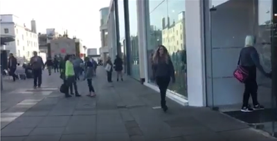
As she dawdles along a little girl runs into vision clutching a magazine, the image of the magazine is not yet visible to confuse the audience and to represent the protagonist’s feelings. She is wearing a fur coat which represents her middle class status and is aged around 7 years old.

There is a cut to a close up of the little girl
at a high angle to look down at her; she tells the protagonist that she is her
biggest fan. This is confusing to the audience as we only know the protagonist
to be normal like everyone else; this starts the mystery of who she is and why
people were staring at her.
hello my name is Imoge
hello my name is Imoge

The scene fades into the next where the protagonist keeps
walking looking around showing nervous expressions, as she walks out of the
shot it fades to black and cuts to the next shot.

We see the protagonist
walking along, shot with a long shot past a shop, continuing to look around
where the antagonist comes along wearing jeans, a crop top and heeled boots and
pushes her into the shop. The scene ends by the antagonist walking into the
distance before it wipes to a new location.
H

H

There is a change of clothing and she is now clutching
shopping bags. Her costume has changed from causal clothes to a dress and fur
coat, this shows something has happened from being pushed into that shop. It
creates mystery and allows the audience to start to think what could be
happening.

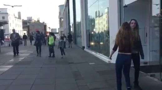
The protagonist walks out of the shot with confidence and her body language is upright
There is a cut to a 1 minute
long time lapse of the protagonist walking along the streets of Burgess Hill,
walking into more shops and collecting more bags. A long shot is used to show
her physique but it is behind her to make it look like somebody is following
her creating tension and mystery.

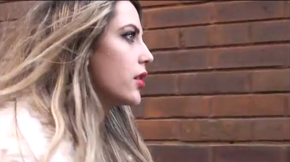
The time lapse stops and is positioned against a wall so that the protagonist can walk past it. She walks past the camera with oblivious intentions but double looks at the camera and then walks back to stare at it. Her facial expressions are captured using a mid-shot where her mouth is wide open to show how shocked she is. Due to what she is looking at being hidden it leaves the audience wondering what she’s seen.

Although she must be seen as a hated celebrity due to the word ‘slut’ being wrote over the picture.

The protagonist grabs the poster, scrunches it up and throws it on the floor, then departing the scene. This shows that our protagonist is angry but upset due to her facial expressions being scrunched up as if to show she wants to cry but the way she marches out of the shot shows she is angry.

The camera cuts to black before revealing a mid-shot of a
car leaving a car park. There is intense music to foreshadow that something
dramatic will happen. There are various tracking shots used to follow the car
out of the car park, by making it long sequences of the car moving it adds to
suspense to who is in this car and where are they going.
A cut from the car
leaving the car park exit to a close up of the protagonist walking along links
that the car has something to do with the protagonist as she is obliviously
walking along. The back and forth cuts of the car and the protagonist show that
something dangerous will happen.

A transition where the car pulls up the protagonist is walking makes it clear that the driver is after her, long shots are continued to be used to show her walking. The camera shots have originally been behind the protagonist, it shows they are following her but a cut to the camera being positioned for a long shot of her walking.

The car door opens and the antagonist appears carrying a bag and sneaks up behind the protagonist who does not know what is happening. The bag goes over her head without a struggle captured by a mid-shot and then fades to black once she has been captured.

The camera fades from black to show that the protagonist is in a completely different location, it is a dark room with red lighting shown throughout which hints that it could be a photography movement. A POV is used to create shaky camera movements to represent how the protagonist is feeling, all you can see if the location which is shown with a mid-shot.

The protagonist
stands up but it only shown through the camera movement because it rises, the
camera moves in on a magazine cover which transforms into a close up of the
magazine to represent the importance of it. It is then revealed that it is the
same magazine cover as the one in Burgess Hill with the writing on.

The
protagonist stands up and walks over to where she was sat, shown by camera
movements still in POV, there is another magazine stuck behind her, this shows
that she is trapped in a room where someone who is following her is located.
There is a close up of the second poster and the protagonist exclaims “what the
hell”.


The first full picture of the antagonist uses a long shot to show her
face and body where she walks into the room and past the camera, her facial
expressions are blank to show no mercy and her body language is upright to
assert dominance in the room.


Another POV shot is used to follow the antagonist around the room making her
look more threatening and powerful due to the low angle the protagonist is
positioned in. The antagonist has dialogue where she is still towering over the
protagonist showing who is in control of the room.

A cut to the protagonist is made with a mid-shot to show how she is still struggling with being tied up; this represents her weakness from the antagonist. It switches back to a POV where the antagonist is still looking down; you see her remove the protagonist’s tape which is against her mouth which is overlapped by her panting.

A series of mid shots are used as the antagonist talks to the protagonist, her body language is intense as her upper body is clenched and facial expressions show anger by scrunching her eyebrows.

Shot reverse shot is used with a mid-shot between the two characters as they argue; it is shown that the antagonist has the lead of the conversation purely because the protagonist is so scared of her.
The POV shot moves to the left in a slow motion to show that the protagonist is thinking about something before it cuts to a flash back.

The flash back is over exposed to show its fantasy features
but you also see the antagonist in the back ground following the protagonist
showing that she’s been there. The camera slowly moves to the right, drifting
on the antagonist with a mid-shot before fading into another flashback where
the antagonist is following her again.

The last flash back is the most important
because it is when she is pushed into the shop which makes her ‘famous’, this
is the root of the antagonists anger against the protagonist due to her being
oblivious of what she has done for her. All of these shots are in long shots so
that the antagonist is noticeable by the audience.

Shot reverse shot is used when the two characters are arguing;
a mid-shot shows the protagonist begging for the antagonist to forgive her
showing her facial expressions as desperate due to her looking up and showing
tears.

A long shot is used to show how poised the antagonist is, she is looking
down at the protagonist who is not in shot but you can see a bulge in her
pocket. As she reaches into her pocket she produces a gun which is followed by
a fast cut to a close up of it. The antagonist pulls the trigger, the gun shot
noises break and the case falls to the floor leaving the scene fading to black.


The protagonist looks around and is showing signs of waking up by her body
language stretching and her facial expressions yawning, it is giving the
audience the understanding that she has just woken up from a dream. With the protagonist looking under her blanket it is showing that she is looking to see if she still tied up or if she is still in the glamorous dress where she evidently isn’t.


The protagonist continue to curl up against the wall shown
by a long shot in her blanket when a passer-by, throws money at her which she
is grateful for.

The protagonist double takes; shown with a fast cut to follow
the passer-by with her eyes as she walks off. It is revealed that as the
passer-by exits the scene, that is it the antagonist wearing the same clothes
as when she first pushed the protagonist into the shot. This makes the audience
question, was it really a dream? Or did it actually happen?
Film Posters
Film posters are used to promote films and to specifically target the select audiences. By using a film poster it can advertise across a wider range of utensils such as on the side of bus stops or even at the cinema allowing people to get inspired and be encouraged to watch this film. To create a successful film poster you must include certain conventions, including:
- Bold Image
- Title
- Director, Producers and Actors
- Quotes, Recommendations and Ratings
- Awards
- Taglines
- Release date
- Billing Block
- Website, Social Media links
The first low budget short film poster I researched was

The poster uses space galactic colours for the theme of the poster which links to the title 'intergalactic taxi service' and it also represents the film of travelling around the galaxy.
The layout of the poster is that the title and the billing block is at the bottom so the main focus is the 6 characters but as there are only 2 females and 4 males, females are underrepresented and only express the roles of a motherly figure and someone who is being neutered (the child) but they are in charge of the wheel. He relates to the background because he could be shown as controlling the sky and that the females are breaking the rules as they are in possession of a steering wheel which looks like a pirates ship wheel. The male figures are represented with authoritive roles as soldiers or conductors which show they are the dominant more important because the main character is positioned in the centre and is slightly larger and by his costume of rounded glasses, large hat it shows his character as a conductor.
Despite the poster being animated you can clearly establish the facial expressions and body language the characters are showing. The two females at the front are showing excitement and positivity to the journey through their grinning faces and their body language suggests they're close but the elder female leaning on her in a close manor. The title is white so that it stands out against the galaxy background and "Bill & Maggie's" is slightly enlarged and is on a different level to the text beneath it which is "Intergalactic Taxi Service". This shows that they are the key focus of the film. By positioning the title near the bottom it gives more room for the pictures which take up 2 thirds of the poster.
The actors names are only placed in the Billing Block but their production company logo "FilmmakerJ Studios" is on the left and right bottom corners so that they can be recognised.
The genre is a fantasy film due to it being set at the 'intergalactic' and it showing the characters in a galaxy filled environment. It is aimed at families due to it being a taxi service in the galaxy so it is family friendly and easy for everyone to watch. Although it doesn't have a specific certification so it'll be good for everyone to watch.
In contrast to this low budget short film poster, I analysed an independent high budget film poster.

The actors both have sincere facial expressions shown by using a close up shot, the top female is staring into the distance on the right, she looks frightened but concerned whilst the bottom male character has an evil look about him as he stares into the camera with wide eyes. It makes you feel for more intimidated and adds intensity to the film. The main image is of a male and a female, due to the title "We need to talk about Kevin" it represents the relationship between the characters as it takes a close bond to "talk about" them. The female actor is represented as scared and worried, this could be because of Motherly instinct but the glare in her eyes posses anger towards the male character. The male actor is represented as evil due to his long stare into the character which can show he has done something bad. Due to the characters showing close resemblance you can tell that they are related as their facial expressions mirror each other and they have similar Caucasian features with dark hair and pale skin. The images don't relate to the background as the shots are close ups to see their sincere facial expressions which don't relate to a background. The lighting of the poster is mid lit because it makes the red titling look more severe, the red also represents blood and gore which can give a hint to what the film is about. The title is in the centre of the poster where "KEVIN" is bigger than the rest of the writing which represents that he is the main character and that he has a problem due to them having to talk about him.
We Need To Talk About Kevin was described as "masquerades as a psychological puzzle but is essentially a horror film full of decorous sensationalism". Therefore it is rated as a 15 due to blood, gore and mild nudity. The film was originally premiered at Cannes Film Festival where they were successful and then went onto showing.
There is no tagline but a review by The Times calling it "Earth shattering" with a 5 star rating to attract the audience to watch it from the poster
Overall
- The differences between short film posters and feature length independent ones are very clear. The first difference is the amount of people in each of the posters. In the short film there is over 6 people, whilst in the feature length there are only 2 people. The difference is because in a short film the actors are not recognisable and featuring just 2 would be confusing and nobody would know who they are so having 6 people doesn't try to make the poster into anything it isn't is. Hence why the feature length has 2 people who are famous movie actors. The attention will be focused on them.
- The second difference between the two posters is the reviews. The short film poster does not have any reviews or ratings on the poster whilst on the feature length poster it has a review in the bottom third. The review is used in the feature film because it has actually had the credit from The Times and able to get a 5 star rating as it is a recognisable film and with the future of having a widely recognised film. Whilst a short film would not get such a good review from a big company in time for a poster.
- The third difference is the actors names. In the short film poster there is no actors names whilst in the feature length poster, the actors names are quite clear at the top. This is because the feature film poster has actors people will recognise and be inspired to go and watch whilst the short film poster will have no recognisable people.
Our Poster

Our films mirrors conventions such as Bold Image, Title, Awards, Billing Block, Social Media links, Quotes


However we did not include conventions such as Director, Producers and Actors, Recommendations and Ratings, Release date and a Website.
We need not include the convention of mentioning the Director, Producers and Actors because in our billing block we have featured all the names of everybody involved and due to being a short film made by an independent production company, nobody would have heard of the actors featured on the poster. You can see that in the two posters I analysed. Recommendations and Ratings were not mentioned because we gave quotes by reviewers who our short film audience would appeal too and there was no rating due to us not thinking of a specific rating yet. It is not usually found in short film posters a release date. We did not include a website either because of the use of social media links such as YouTube and twitter which were featured and also a Facebook link on the poster. As a starting up production group we did not think it would be necessary to create a website as it may not get enough required attention.
Little White Lies Review


??Little White Lies is a bi-monthly print magazine committed to promote great movies and the talented people who make them and was established in 2005. Combining cutting-edge design, illustration and journalism, Little White Lies has been described as being “at the vanguard of the independent publishing movement".??
??The target audience for Little White Lies is slightly older readers who are really interested in the context and content of the specific film.??
 A Little White Lies Issue consists of:
Adverts

Reviews

Interviews

Photography
CONTENT OF A LITTLE WHITE LIES ISSUE
The magazine will purely focus on one topic related to a film or a style.
The article I will be showing is their 33rd issue of Black Swan.

Every article is split into six chapters which consist of the lead review, an editorial introduction, a series of articles inspired by the feature film, theatrical reviews, the Back Section and future releases.
- The Lead Review


This example of the lead review is the typical style and structure Little White Lies use in all their reviews. It follows a structure of a bold picture of a feature in the film, the large letter at the beginning of the first paragraph (C), 5 paragraphs about the film. Each paragraph talks about a different aspect of the film including context and information about the main characters. The last aspect is their rating system, rating on ANTICIPATION, ENJOYMENT, IN RETROSPECT with a score up to 5.
2. The Editorial Introduction

An editorial introduction is used because Little White Lies pride themselves in having a personal touch with their audiences. This chapter also includes adverts and information about technology with Little White Lies, like their app.
3. A series of articles inspired by the feature film

Chapter 3 is the main focus of a Little White Lies issue. This chapter only focuses on the film the magazine is set on. In the Black Swan issue it has a specific type of font as seen in the top picture on the right. They have used dance moves to create titles to emphasise the theme of ballet which is the theme in the film.
 With these titles, nature and animalistic objects are used to create the words which mirror the swan image that is portrayed throughout the magazine. The theme of black and white is strong throughout.
4. Theatrical reviews


Chapter 3 is the main focus of a Little White Lies issue. This chapter only focuses on the film the magazine is set on. In the Black Swan issue it has a specific type of font as seen in the top picture on the right. They have used dance moves to create titles to emphasise the theme of ballet which is the theme in the film.

4. Theatrical reviews

The theatrical reviews are the biggest feature of a Little White Lies as it is what the magazine focuses about. Little White Lies pick recent films and review them using the structure as I previously mentioned. These films target their demographic audiences preferences and what films appeal to them.

5. The Back Section

The Back Section features directors, producers and artists with either a memorial section to those who passed away such as Kevin McCarthy and Jamie Gillis in 2010. This adds a personal touch to the magazine and also talks about DVD's coming out soon.


6. Future releases.

The last chapter wraps up the magazine by announcing films coming out. This is a good way of appealing to their target audiences who have an interest in films.
Our Little White Lies Review
In order to mirror the conventions a Little White Lies magazine, I looked through various issues and watched a prezi of what it entailed.

Convention 1- Bold Image

The bold image is a picture taken from a moment of our film which we particularly liked due to the good lighting. I think the picture contradicts with the title of the film because being homeless doesn't connect with a magazine but this makes it effective as audiences will be intrigued. This is also the picture we used for our film poster.
Convention 2- Main title, directors, actors, release date

The title of the film is in bold and below is the production company and actors. We have mirrored the font used in Little White Lies issues and how they make the key facts bold like "JAI Productions".
Convention 3- The Review

Below the title is the actual review which is split into 5 paragraphs, each focussing on a separate topic like context of the plot.
Convention 4- Rating within anticipation, enjoyment, in retrospect

The rating is how the review is wrapped up. We have copied the identical format of a Little White Lies rating system with the specific rating categories. Here we have rated our short film accurately.
All of these features contributed to the success of our well done review

A well presented, professional review.
Well done Imogen - you have worked really hard on this, and it's really paid off! Just 2 comments on qn 1 on the film - I'd question your statement that you had no 'problems' to resolve in the narrative of the film - couldn't the fact that the protagonist fears this scenario be evidence of a deeper psychological fear of loss of status or similar? Also, your analysis of the 2 examples of real short films, do look like you've just copied and pasted from your earlier research. If you haven't, you need to show that this has been written now (eg "i noticed that..", "when compared to ....the film confirms that this is a feature of the short film form" etc. On the poster section, you need to show understanding of the differences between short film posters and feature length independent ones, like we established in the lesson on this (the difference should also be clear in your blog at that time).
ReplyDelete