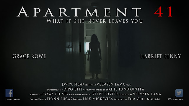
- Apartment 41 is a short horror film and we can tell this because of the different layout to full length films however it is also weird for a short film because of the placement and size of the text.
- The layout is different in the way that the actors names are almost the same size as everyone else's name involved in the making of the film and you are given a little bit of information about what the film is about.
- This is because in a short film the people who make the film are just as if not more important than the actors so they should be as well known as the actors are.
- This information is written underneath the title where it says 'what if she never leaves you' and this intrigues the audience because it is asking them a direct question. However this is a weird thing to have on a short film poster as they don't usually feature tag lines like this. Tag lines are usually only used for feature length films.
- There is very little colour in this film poster which is iconic of the horror genre.
- The Facebook and twitter logos are featured on this poster which is again different from a full length film. This highlights that you can watch the short films on them and it is advertised using them. This is a good way of advertising themselves as well as the film.
- There isn't a variety of fonts used which is different to a full length film.
- We can only see one character on the poster and because she is silhouetted we can make an educated guess that she is the antagonist.
- This guess is based on the fact that she is mysterious and haunting which is iconic of a demon or other antagonist in a horror film.
- The colours of black and white are basic but effective as they contrast well and makes the text stand out. The actors names are written on either side of the poster and although there is nothing indicating that they are the actors names we know they are because they are always the biggest on every poster.
- We can tell from the poster that the film will most probably follow Todorov's theory of narrative because most horror films do and because the demon invading on their lives is classed as the disruption part of the theory and that this picture is most probably to show this disruption.
- The title is in a white font until the end of it which is in red and this is effective because it means the people who see the poster will find it easier to remember the name than if it was in a white font like the rest of the text.
- Because it is a short film there is no set certification but it looks as though it would be aimed at a higher age group rather than a lower one due to the haunting poster.
Monday, 24 October 2016
Apartment 41 poster - Poster research - Alex
Subscribe to:
Post Comments (Atom)

Try to link some of your comments to MRANG key concepts - you need to do this for the deadline requirements. You don't comment on the fact that this is a short film. Can you find evidence of this in the poster? Google the film company for more information about audience and production.
ReplyDelete