Tuesday, 29 November 2016

Poster option with feedback

Reasons why my poster will not be put forward for the final 2 posters!


Here is my printed poster.


The reason we decided not to put my poster through to the final 2 is due to the fact it is way too dark and you cannot see the protagonist which is the main focus on the poster. This defies the audience of understanding the social representaton and the bad representation of Women.


I also had someone else evaluate my poster so that I could get a second opinion before we went forward and the evaluated agreed with my thoughts.


Thursday, 24 November 2016

Audio Editing

Audio Editing


When we filmed we used an iPhone 6 to record two sets of dialogue for the film. Due to not being able to get a voice recorder we chose to use the iPhone 6 to record.


Due to not having much dialogue in our film there are only 2 recordings.

In order to get the recordings from the iPhone and onto the Mac to edit I will have to email myself the voice recordings and save it onto the Mac.


Here are the files I emailed to the Mac.


The audio is now saved onto the network. Ready for us to edit into the film.


Background Audio


In one of our scenes, Louise is walking along Brighton sea front and there is no audio to accompany it. So I have combined a Seagull sound and Water Ocean Waves so that the audience understands where it is set. I think it also works well with our location settings.


I used garage band and searched for seaside sounds and ocean sounds to create the sound. By putting the two different sounds together it creates a different ambience where the seagulls do not over power the sea. This is important as the seagulls are not actually visible so it might confuse people.


Re-shooting - Alex


When we were in Brighton the camera we were given broke so we had to resort to using an Iphone to film our short film. It looked good at the time but when we put the footage into final cut pro the quality of it was not up to standard so we have decided to re-shoot some of our footage. Due to limited time we will not be able to go to Brighton to film and will have to substitue and film somewhere more local like in Burgess hill. We will have to try and make the footage look as though it is in Brighton so the shots will be restrcited as oppsed to unrestricted like before. Filming in two different locations may make the film confusing especially as Brighton is so much bigger and more interesting than Burgess Hill so we will try to use transitions so that the sudden change won't be as obvious. We will record the progress as we re-film and hopefully the final result will improve the standard of our short film.

Editing Evidence - Alex

Joe editing our footage

We still need to add in our re - shot footage because some of our footage isn't good enough quality and we also need to add in any sounds that we want.
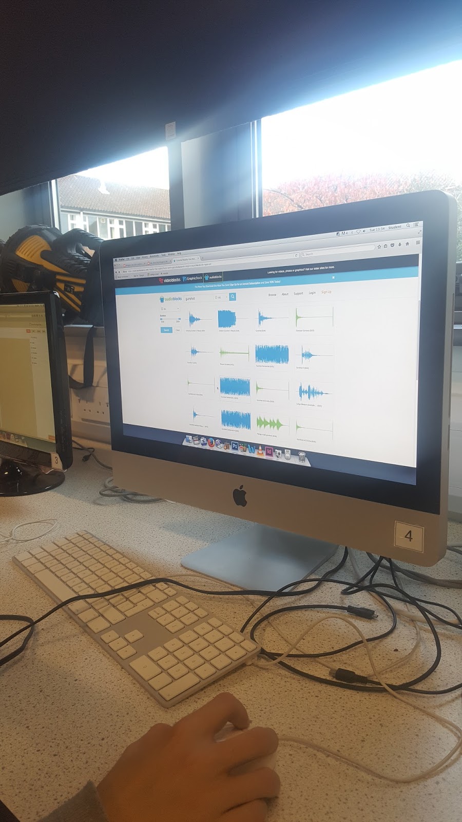
Finding sound effects for our short film

Tuesday, 22 November 2016

Research on Little White Lies

Little White Lies Research


Little White Lies is a bi-monthly print magazine committed to promote great movies and the talented people who make them and was established in 2005. Combining cutting-edge design, illustration and journalism, Little White Lies has been described as being “at the vanguard of the independent publishing movement".The magazine has since become renowned for its independent ethos and iconic covers.

The target audience for Little White Lies is slightly older readers who are really interested in the context and content of the specific film. This relates to my short film target audience as we are targeting older readers too because we think the social realism message will target older readers as it is gripping and meaningful..


Little White Lies is published six times in 14 months, and then distributed around the country by environmentally friendly carrier pigeons. You can now subscribe today for £29 and recieve this magazine. You can also read up on the interent (their website) or download the app. It has a variety of topics, it can range from reviews of films to interviews with Liam Gallagher.

Layout


From researching Little White Lies magazine I have identified that they present their images towards the top of the page, therefore leaving the bottom half of the page for the text. Little White Lies also use images that suit the genre and text presented. For example, in their review of the film Lawless, Little white lies used dark images in order for the review to suit the films genre which is crime fiction. In order for the picture to represent the genre they used dark colours such as presenting the picture in black and white which shows the films seriousness and how it is vintage. The images used relate to what the text is explaining in order for the reader to be able to visualize what is being said. 

In order for my film review to match the style of Little White Lies I will use these conventions in my film review. I can use a dark picture presented in black and white to show the seriousness within my film and to portray its sincerity and genre and I will use an image that would allow the reader to visualise the characters within the film.


Language and mode of address style

The typical conventions of the text in a Little White Lies magazine is that the writer tends to use puns and remarks in order to create some humour for the audience. There is also an indepth explanation of the film and also the films strengths and weaknesses.  Also in the information presented the writer describes the previous successes of the actors/director. The writer also uses quotes from the actors/director or from the film itself in a very creative way in order to get their point across. Although the writer is typically very judgmental of the film the writer do not lack in providing the reader with a thorough review that will answer all questions they have about the film.

Our Poster Designs


Our group poster designs


All 3 of us have designed completley different posters. Originally the idea was for all of us to follow The Magazine set up idea but only Alex did.

Here is her poster design.


Joe took a screenshot from the film and turned it into a poster. 

Here is his poster design.


I used a picture from our shoot.

Here is my poster design.


Now we will choose 2 posters from the 3. As they are all very different we will take opinions from other people so that we can get a different outlook on which poster to choose.

Evaluation on my Finished Poster

Finished Poster Evaluation


This is my finished poster. I will be evaluating it and explaining why I chose the features I used.


The Title

Choosing my title I had a variety of options to use. In my previous blog post (click here to read) I spoke about using 3 different fonts. 
-Garamond
-Helvectia
-Bloodlust


In the end I used none of them. I chose a font off photoshop called:


And it ended up looking like this:


The font created the look off the writing but in order to make it have extra features such as it having a glowing white edge I used other features off photoshop.


Bevel & Emboss

Gave the bold effect

Inner Shadow

Created the shadow off the title, I chose a white shadow to make it stand out

Inner Glow

Made the title glow 


To create the colour of my title I used the Dark Room red lights and pasted the colour into the title.

Here is the red lights.

Although it has turned into a slight pink colour I think it contrasts with the black background really well which coinsides with the thriller/genre. The colour also makes it stand out well and makes it more noticiable, emphasising the importance of the title.


Reason for Title name


I chose the name "The Magazine" because it works well with features within our film where the Protagonist sees herself on a magazine. It also creates a sense of mystery due to the title not fitting in with the picture of the poster, this shows our thriller genre.


 The Picture


On the left is the original photo, this was taken during a shoot and was spontaneous for a picture on the blog. You can see that the lighting is dim and is mainly made up of the red lighting and the red lighting isn't as bold.

On the right is my finished poster. As you can see I have made it considerably darker and emphasised the red lights to make it look more eerie. Despite the idea being to make the audience scared by the dark lighting, I do think I have made it too dark. If my poster gets chosen as the main poster I will lighten it as you cannot see the true scared facial expressions of Louise. 


Representations

In the poster there is a negative representation towards Women due to the protagonist being tied up, this gives the image that Women are the submissive gender in the World. Due to our film being targeted at teenagers aged 15-25 this gives a negative message to our target audience as they might be inspired by the negative approach towards Women. 

Short Film Poster Genre Conventions

Our film is a thriller/ horror genre and I think I have achieved the conventions within my poster.
By making my poster dark and having the main character tied up, it complies with the horror conventions genre as you are unknown of what is in the darkness and why Louise is tied up.
It also matches thriller genre conventions because enigma is created through the darkness of the settings.